Posts

Pixilation Project

  For this project I mounted my phone next to my desk. I remotely took selfies of myself moving from one position to the next. In the stop motion video, you can see me walk towards my desk, set down my laptop and open it up. Then I grab the laptop and leave. The video can keep looping around showing me approaching and leaving my desk.

Autoscopy Project

Image
For this project I chose to make myself appear to disintegrate. After taking the picture, I cut out a mask of just me in order to remove the background. Then I duplicated the image and mask and applied a liquify filter to the original image. On the top image, I cut out small holes to make it appear I was disintegrating. For the background I used a purple and orange gradient. On top of all the layers, I applied a cinematic color adjustment layer to make the colors pop out more.

Multiplicity Project

Image
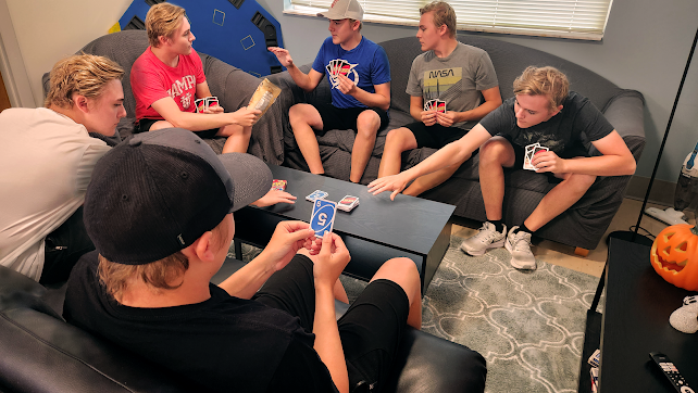
  For this project I took six pictures of me wearing different clothing playing a game of Uno. I made sure to have the images layered in a way that some versions of me were on top of others. I made sure to keep shadows so that it looked natural with the lighting in the room. The different versions of myself all interact with each other in different ways. One is looking at his winning card. Two others are reaching for cards. The version of me in red offers snacks to the blue shirt me. While he gets his snack, the version of me in the NASA shirt cheats and looks at his cards.

Somewhere Project

Image
  For this project I chose to put myself into a scene from the movie Jurassic Park . I first inserted the picture of the movie scene. Then I layered a picture of me crouching over the dinosaur. I layered another picture of the movie scene on top of me to have the dinosaur and the girl appear in front of me. I added in noise and adjusted the contrast and brightness of the picture of me to make it better match the look of the scene. Lastly, I added in shadows onto my face and shirt that the dinosaur is creating. I also added in shadows that I'm casting onto the girl's hand and on the dinosaur's nose. This picture is without the added shadows: I cleaned up the picture:

BW to Color

Image
  For this project I choose three different triad color palettes from adobe. I set the color in the middle of the palette to the color that would be for my skin. This way all the other colors (for clothes, hair, background, etc.) would pop and have contrast to the skin. 

Poster Project

Image
I decided to make my poster for a made up music festival called Surf's Up. The color palette I used had the perfect colors to make a tropical beach to match the theme and location of the festival. I used 2 separate fonts. One for the festival name and the other font for everything else. The fonts are both rounded with the one for the festival name being more stylized. The roundedness of the fonts help the words fit in with the roundedness of the trees, sand, wave, music notes, and guitar. The words use the 

Calligram

Image
Final Calligram   Second Draft First Draft I wrote a letter to my self in 20 years and then applied it to a portrait of me in the form of a calligram.  For the calligram, I used a more rounded font, Modak, found in the Adobe Illustrator font library. I used this font because it is rounded in the same way that my face is rounded. I used the letter to my future self as the outlines for my face and shirt. I used the ending of the last sentence (Colin make our dreams come true) to fill in my hair, face, and shirt. In the first draft, my eyes, nose, and mouth are a solid shape rather than words. I originally did this because I thought it blends in better with the rest of the picture as I used a big solid word for my forehead, hair, chin, and cheeks. In the second draft I changed the solid eyes, nose, and mouth into words from the letter to my future self. For the final draft I changed the colors. The colors used are sampled from the picture of me. I used the same exact color of my hair, lip